A while back I mentioned a desire to sell some artwork. I have come up with some samples.
The following items illustrate some of the artwork I am interested in producing: pinups in scenery, pinups in plain background and fantasy images. A close up of the face of the pinup in scenery shows the kind of realistic detail that is in the images. To see larger versions, download this zip file (8.3 MB).
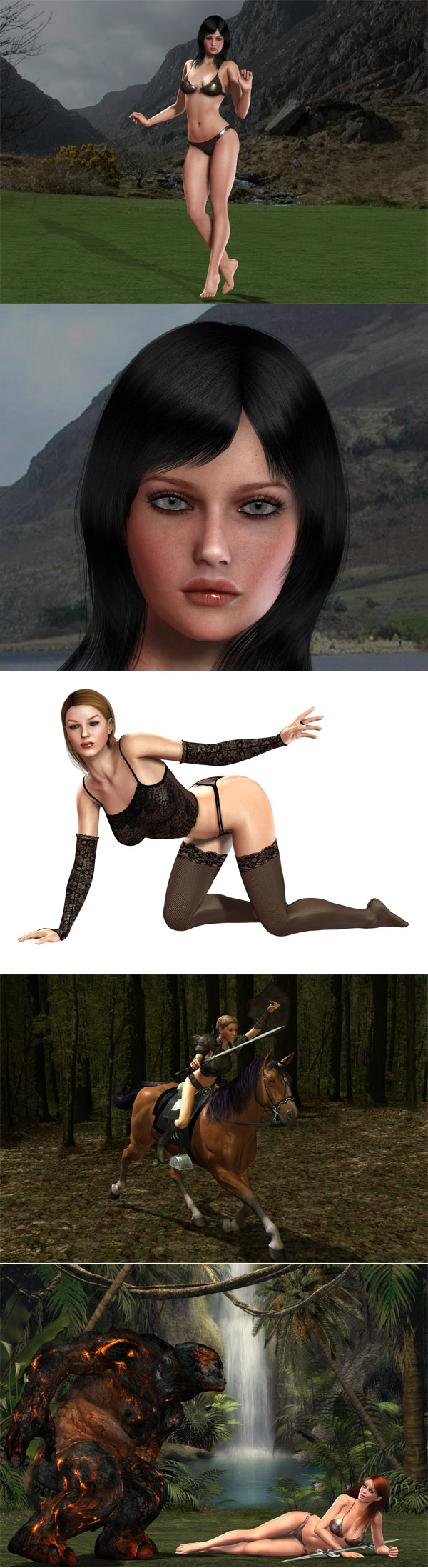
All art items shown above are computer generated. It took more time to learn to generate them than the actual time spent in composing a scene and having the computer rend it. The items shown should not be considered final versions. They need refinement, and I still need to work on getting the lighting right. For instance, the mountain scene with the pinup doesn’t have the shadows right and the relation between the woman’s feet and the ground isn’t correct. And, the pinup in lingerie doesn’t have the stockings meshes right.
I would really like to create much better art than the amateurish attempts above, with multi-character complex scenarios, sci-fi imagery and special effects, but, as of present, the time spent learning how to do it will be worth it only if people are interested in buying such art.
I plan on offering both print versions of the art as well as digital versions for those with professional photo printers. A note about print-ready images is important. On screen, the resolution of an image is measured by the number of pixels it contains, whereas the resolution of a printed image is measured in terms of dots per inch (dpi), which is related to pixels per inch (ppi). A resolution of 300 dpi is the minimum for high quality prints. Therefore, if the print size is 8 X 10 inches, then the corresponding screen size of the image for a 300 dpi image would be 8*300 X 10*300 pixels or 2400 X 3000 pixels. This image will be too large to fit on most computer screens. For instance, two common screen resolutions are 1027 X 768 pixels or 1280 X 1024 pixels, both too small to see the entire image without scrolling. I plan on offering both 300 dpi and 600 dpi images, and for an 8 X 10 inches print this translates to a 8*600 X 10*600 pixels or 4800 X 6000 pixels image. So the file sizes are going to be large.
I will be offering them cheaper than most others. For instance, the prices for digital images meant for 300 dpi print sizes (in inches) would be, say, $1 (4 X 6), $3 (8.5 X 11, A4), $5 (11 X 17, A3) and $7 (13 X 19) each. The prices for 600 dpi versions of the digital images would be $2, $5, $7 and $9 each, respectively. The print versions would cost, say, $3, $8, $13 and $16 each, respectively; the extra cost being for printing, shipping and handling (S&H).
The print versions will be offered on professional quality photo paper (buyer decides between gloss, semi-gloss and matte versions) using pigment ink, the longest-lasting ink type. Traditionally, water-based inks have offered more vivid color reproduction, and although high-end pigment-based photo printers have caught up well, professional quality water-based ink photo printers still have a slight edge in vivid color reproduction, and they are cheaper, but their prints’ useful life is shorter, as in fade resistance being rated to a few years, usually not exceeding 30 years, compared to 100-plus years for pigment ink. The advantage of buying digital versions of art is that one doesn’t have to worry about the prints fading since one could print a new image whenever one felt like it.
Those wanting the images printed on special 13 X 19 inches art paper will pay between $20–25 per image, depending on the media desired.
There will be discounts, excluding the cost of printing and S&H, of, say, 10% (5-9 items), 20% (10-19 items), 30% (20-29 items), 40% (30-39) images and 50% (40-plus items).
People who just want the digital images need only pay for the 4 X 6 300 dpi version since these images will be 1200 X 1800 pixels, which is a good size for computer viewing. If someone orders 50 such items, he will only pay $25, which is an excellent deal for high quality art items. I plan on coming up with image sets of various digital women, showing each woman from multiple angles, and in different poses and varied settings.
So if anyone is interested in purchasing such art, let me know.
Comments
I'd worry less about the backgrounds and make the girls as beautiful and feminine as possible. I like the first one. Lingerie girl's hair is horrid."Xena" does nothing for me.
Those are beautiful faces, almost perfect. Second one and the last one are best. Only, I wish the black haired girl didn't have such heart shaped upper lip, I find it annoying, why couldn't her upper lip sweep in gentle slope from the peak of cupid's bow to the corner of the mouth?
And her philtrum is unpronounced, I like sharp columns and sharp peaks of the arch.
Everything else is great, except that it would be nice if she had milky complexion and blond,long and flowing mane. Yeah, I would even pay, but for really nice, elaborated scenery, not that ugly fictional monster abomination. And transcontinental purchasing is horror.
Oh, and couple that miss Perfection with Mr. Skywalker, please....umm, in rococo style :blank:
I like these. Especially the second one. A few comments:
- I agree with bron about the upper lip of #1. It seems too thick relative to the bottom lip.
- Also, either the top of the head is set too high, or the eyes are set too low (creating an effect that looks either pedomorphic or like Elvira). Hair gives some tolerance because it rises above the top of the head, yet her particular hairstyle does not have this effect because it looks relatively flat. I would suggest either moving the top of her head slightly lower, or changing her hairstyle so it looks like it protrudes higher above the top of the skull (without it going any higher than it does now).
- There is something a little strange about the eyes and I'm trying to figure out what it is. It might be that the eyelids aren't properly casting shadows on the eyeballs.
- In the full body picture, the thighs seem a bit wide, especially the one on our left.
- In the second on, her eyebrows seem a bit too angular.
- I like the poses of all of them. The arched back of the second one is especially sexy.
P.S. I know you are bogged down with email, but here are a couple interesting points for discussion sometime:
- The goth and punk subcultures, and how they are home to a highly disproportionate amount of people of the nonheterosexual taxon
- The phenomenon of bisexual men and and bisexual women getting with each other, and why
I know the guys will probably not be minding this, but I just can't help noticing that the girl on the last photo looks like she was posing for a men's mag photoshoot when a freak of nature paid her a visit. And she looks amazed and curious, not scared. Haha! :lol:
All the women shown are hot, but the pictures make me giggle. I think photos in men's magazines are more artistic. It's just that, yeah, men's mags should find better looking women.
By the way, why didn't you decide to use real women instead?
Emperorjvl: You are right, the women are the main issue, but consider these examples as drafts. The final versions will be better. The warrior woman would appeal more to men than women; I am great fan of them, and will be coming up with much more elaborate/impressive huntresses and fighters.
Bron: An advantage of digital art is that hair and skin color as well as lip shape, philtrum definition, etc. can be easily changed. I will offer the possibility of minor customization for those serious about purchasing an art item. Monsters can be removed from the scene easily just as men can be added and the scene made romantic. However, romantic scenes will have to be requested. My interests are in warriors, beasts and sci-fi imagery.
I don’t believe shipping across country lines would be a problem. I will use cardboard mailers, delivery tracking and insurance. This should take care of a wide variety of adverse scenarios.
Hugh Ristik: I am aware of problems with the hair placement and eyes on the black-haired woman. The face close up uses the same lighting as the one used to render the full scene instead of lighting that one would use for a portrait, but I did this to save time. The main purpose was to show the kind of possibilities that exist with digital art. The legs are a bit on the thick side because I was initially thinking of turning her into a hunter, but decided to come up with an ordinary pinup.
Regarding the goth culture, homosexuals and bisexuals often lean toward joining atypical subcultures, like many people who feel that they are different from most others. I haven’t found goth impressive except for the combination of black hair and pale skin, which I like.
Bisexual individuals are more likely to be in touch with GLBT groups/cultures and it shouldn’t be surprising if bisexual men and bisexual women disproportionately partner with each other. Another reason is that bisexually behaving individuals are more likely to find a partner accepting of simultaneous relationships with more than one partner if this person is also bisexual.
Brenda: More men than women will readily understand why the woman is not scared of the monster. I can certainly come up with more artistic digital art.
I would use attractive real women if I could find them. If the big magazines can’t come up with enough good lookers, how well can I do? The only realistic scenario is to come up with a good incentive package ($$$) for attractive women to come forward, but I would need lots of money for it, and selling high quality art would be a step toward acquiring the funds.
In any case, even if the women were real, I would still need to use 3D imagery-generating software and Photoshop to put the women in fantasy scenarios, and by the time I get around to doing this, I will have decent skills in 3D. However, I will not be digitally editing the shape of the real women models. Digitally removing a freckle to two is one thing, but women who need to have their shape edited shouldn’t be modeling for me in the first place.
Right now I need to come up with more refined and anatomically correct images, and start selling digital versions first.
"More men than women will readily understand why the woman is not scared of the monster".
Explain?
The reason why more men than women would readily understand why the woman is not scared of the monster is because more men than women are into video games and action comics where one sees feminine/voluptuous women in the roles of fighters, huntresses and warriors.
First one is good, on subject of lips a characteristic of womens lips I like is 1/4 inch of front upper teeth showing, i.e. upper lip not competely shut, dificult to render I should think. Good pose on balls of feet, it looks flirtatious. Standing like this would tend to make thighs look defined which is appealing.
Second one the pose is fine but from that point of veiw or angle it would be it a challenge for a Frank Franzetta.
Third one is very ambitious in my opinion.
Baldie: Showing part of the upper teeth is not difficult to render. Anyway, the items shown above are too amateurish. My digital art has improved. For instance, I submitted this render to a digital art contest a few months ago, and although I didn’t have the time to add clothes or fix the hair before the deadline, I still managed to be runner up. They were even interested in purchasing it, but when I told them about part of what I did, i.e., this site, they freaked out and that was the last I heard from them. I also sent them these renders then. I know I can come up with sale-worthy art; I just need to find some time to practice more and then get down to generating the art.
All three are very impressive.
The face skin is excellent, it looks natural.
According to a hair expert I heard, at the begining of the hair cycle the tip of the new hair grows in fine then getting thicker. Apparently it's the reason why after shaving hair grows in feeling thicker; its blunt ended. Thats my rationale for asking; could the tips of the upper eyelashes stand being a bit more tapered?
Those digital art types probably sound artists out for commercial awareness, they were hoping you didn't have any.
I used facegen to create this face. my goal is to create a REALISTIC face that looks FEMININE and looks good from all angles in her EARLY 20's
I realized facegen doesn't give you enough option to adjust forehead and eye socket depth, so those are beyond my control.
I just want to know why does my model look weird, there's something about this face that irks me but I don't know what.
can someone tell me which face looks most realistic and most likable? I want to make sure the face ratio is done correctly.
here is face 1 shown in many angles
knightingale: I think I can tell you why your generated faces look weird. Your intention was to make something realistic, and they do not look it, which is not because they look computer generated or are bald but because they are ethnically ambiguous.
Your apparent intention was to make a Caucasian woman whereas you have Asianized the faces in some parts. You will need to lower the brow ridges and raise the nasion somewhat. In front view, you will need to make the nasal bones a little thicker on top and the fleshy part of the nose a little narrower. In profile view, you will need to make the bony part of the face less flat in the middle, raise the nasal bones (not the lower part of the nose) and make the chin more prominent. This addresses the weirdness part. See the pictorial contrast with unambiguously Caucasoid women (not necessarily feminine) below, and if you live close to Caucasians, then take a good look at their faces.
You still have to deal with femininity. To increase femininity, in profile view, shift the lower third of the face (below the nose) forward, and in front view, #3, a wider look, is preferable to #1.
Regarding attractiveness, keep the face feminine or if not feminine then with fine facial features, do not Asianize or Africanize, do not shift the nose toward southern European or Middle Eastern norms, and keep the cranium not too high and elongated (do not make it more Slavic, Alpine or Armenoid).
FaceGen modeler does not give you the control you need. A better option is the Victoria 4 3-D model with the face morphs pack that you can use with poser or the free version of DAZ studio. The ultimate, and professional, solution is something along the lines of Zbrush.
I liked the 2nd face you posted for your sample artwork, but because I know that proportion is not possible on real face that's why I want to see if I can create my own version of it that looks more real.
so I followed your suggestion and made the changes on face 1 (I chose face 1 because face 2 and face 3 were changed too far from the original)
I couldn't make all the changes you mentioned like moving the lower 1/3 of the face because I can only move the jaw out and protrude the mouth. But doing so would not allow me to build a smooth chin while preserving overbite.
I want a chin that's not too pronounced so that it adds to the overall smoothness but perhaps you are right it does add to the weirdness.
anyway, the changes to face is shown below, but I find it look even more weird. maybe it's just my preference...
at this point I can't do much for the face any more and decide to start over using the auto generator in facegen and work from there. here's the result.
it looks more natural that's for sure, but I don't find it attractive at all even though I already added some color texture to it.
perhaps you know facegen more than I do and maybe you can apply the changes easier too because I can't read the jargon easily and perhaps I read them wrong that's why the changes are weird.
here are all the faces I have generated
http://www.mediafire.com/?6doe96s9f84dmcd
btw, do you have msn? when I post these images on other sites asking for help, no one has can point out and help me. you are the only guy I found to have the knowledge in this area. I could really use your help, man.
I didn't know the daz3d is free until you told me. free daz3d and free victoria 4 should make this very interesting, but I doubt my computer can run it smoothly right now.
the reason I stick to facegen was because the changes I made to individual parts also affect the values of other features. I don't know if the other modelling software have this feature built in to preserve the relationship for realistic looking face.
knightingale: The second face you liked in the artwork is Victoria 4 (all of them are her), modified from baseline, which you could easily modify to make her more realistic.
Facegen’s making coordinated changes is a limitation to the freedom you need to come up with your own highly custom figures. To get more options, you can export your facegen model to 3DS or OBJ formats and then import them into Blender, which is free and open source professional grade 3D modeling software.
You can also patiently practice on facegen and get better results. Facegen is more capable than you might think it is. Here is an attempt to model Angelina Jolie’s face using facegen (the person who modeled it goes by strigoi): http://www.femininebeauty.info/f/angelina.jolie.3d.approx.jpg
The likeness is unmistakable. You can get the fg (facegen format file) for Angelina here: http://www.femininebeauty.info/f/angelina.jolie.fg
You can find fg files for many other other celebrities here:
http://www.relativitybook.com/CoolStuff/faces.html
http://www.relativitybook.com/CoolStuff/facebank.html
Import an fg file into facegen and you have a 3d model of the celebrity right there, and you can look at the settings and learn.
Your stated reason for sticking with facegen, that it attempts to preserve relationships for realism, indicates limited knowledge of anatomy and the nature of beauty. To come up with great 3D renders, you will need to use good software, become skilled at using it and acquire sufficient knowledge of anatomy and beauty (e.g., go through this site). This takes time even if you are strongly motivated.
I am not sure about Victoria 4 being free unless there is a limited promotion, but Victoria 3 is free and you can use it with the free version of DAZ studio. DAZ studio and Poser do not have the limitations of facegen as they allow you to manipulate parts independently because users create all sorts of supernatural creatures with their human figures. But you are still limited by the morphs that are built in unless you either use deformer magnets or learn some python or javascript (scripting languages; python for poser and javascript for DAZ studio). Victoria 4 has her own limitations as she has a malformed armpit region and does not transform well in extreme positions. So if you are going to invest time in 3D, do not forget something like zbrush.
If your computer’s GPU is not up to the task, then you should be looking at an upgrade, and computers nowadays are cheap. A laptop with 4 GB of RAM and an AMD fusion APU such as E-350 (Brazos/Zacate) or, better, A6- A8-series (LLanos) has a graphics unit that supports open GL 4.1, open CL 1.1, DirectX 11 and has all the muscle you need for $350-$500. The CPU will not be fast but you could live with longer times to render the finished product. You could add a 23/24-inch e-IPS LCD monitor for $200 to address the problems with accurate color representation in the typical TN laptop LCD screen.
I do not use MSN or any other I.M. program. Just use email.
building faces out of celebrity isn't really impressive because that's just using photofit function to generate those faces. the photofit faces look like actual faces sure, but that's because the textures are copied from the photo. it would be nice if the photifit feature could capture faces better because half the time the faces it captured are often too big when hair covered up the ears.
I probably won't do any more facegen stuff after this final time I ask your opinion on this.
this is taking default feminine generator face and work from there.
the 2 faces have minor differences, but why is it that I am finding the left one looking more natural than the right face? the left face also fit into all the different hair cut much easier than right face which looks odd in all the hairs.
are the eyes and forehead in the right placement for femininity?
I like the default nose so it remain on the default scale from auto generation.
there's nothing I can do about the head size and neck placement right now so I can't move the face forward any more than I want to.
let me know what are the preferred option for alternation without using heavy use of jargon, technical anatomy terms is giving me a hard time to decrypt your replies, thanks for the help.

alright I made the image too big so the upload host resized my image
bigger version of the image
also a question about forehead adjustment.
in your feminine feature description
The middle forehead is displaced towards front and expands towards the side; the lateral aspects are displaced frontward without lateral expansion.
does this mean eye sockets will appear deep and eyes will be more apart because of the forehead shape?
and how big should the eyes be?
another question came up when I got into facegen again.
do femininity makes a face look more childish? round cheeks, wider and shorter face are usually associated with kids. every time I try to make a face, I always feel the face look way too young if I try to make it good looking and feminine at the same time.
Knightingale: You posted two generated faces side by side (#19, #20), and stated that you find the left one more natural. These two faces differ slightly, mainly in the lower jaw. The lower jaw is retracted in the right one, a condition that will approach class II malocclusion if you exaggerate it, which sharply diminishes attractiveness. You can learn more about this profile here: http://www.femininebeauty.info/mandible-profile-and-marquardt-mask
Even though you do not like technical terms from anatomy, you have no choice but to either become familiar with them or with the shape variations associated with them or you cannot be a good artist.
The face on the left is also wider and the eyebrows more rounded.
The forehead description you took does not by a long shot mean that eye sockets appear deeper in women. Is this what one observes? The description is about the middle of the forehead, and it means that women have more rounded and less receding foreheads than men.
Wheres female faces are closer to children’s faces on some counts such as shortness or size, sexual maturity associated with feminization makes adult female faces look adult. You mentioned rounder cheeks. In small children, rounder cheeks comprise of small/poorly developed cheekbones but puffy cheeks [flesh], whereas feminizing sexual maturity expands the cheekbones in the cheek area and the maturity process shrinks the soft tissue puffiness in the cheeks. You have to learn to distinguish between these changes and others like these to end up with more feminine faces that remain adult.
where should the eye placement be for feminine face? in one of your pages I found this
“The superior medial orbital margins are displaced superiorly and posteriorly whereas the superior lateral margins are displaced laterally; the lateral margins are displaced laterally"
so this brings upper margin up and lateral margins out. which means eye socket will appear higher and wider, but it doesn't mention lower margin. if lower margin also moves downward then the entire socket will appear bigger.
is there a general consensus where the eyes should be, how far apart they are, and how big they should be relative to the face? I see some pages offer landmark and ratios, but no solid statement on this.
meant to also ask about what direction the eye should be slanted towards
also need some more clarification on cheekbones. in the "Feminine vs. masculine" page it mostly talks about skulls, and I can't relate skull to real faces as easily.
if cheekbone is "lower and thinner in female", how low is acceptable average? does a thinner cheekbone also mean less wide cheekbone? this will cause face to be less wide as well.
right now I am very confused. I want the face to be oval, but I also want to cheeks to be decently wide and chin shorter and jaw smoother. I want face to look flatter, but the eye always looks deep compare to the cheek area, making it look like slope down. if I make cheekbone more shallow than the face look poor even though the eyes look better.
take this image from your posts
http://www.femininebeauty.info/images/laser.scan.2.jpg
left column blue part means moving inward, so chin and jaw should be retracting
but here
http://www.femininebeauty.info/i/m.profile1.gif
the result says class 1 > class 3 > class 2 even though the image above clearly advocates class 2
so I moved the chin out a bit, moved the cheekbone a bit further down, and it wasn't until I moved the eyes down when I finally find a face that looks great to me.
but I am not sure what eye position is best. still waiting for your advice on this one.
Knightingale: In #24, #25 you asked about eye placement. Look at the following (the more feminine shape is on the left) and follow the idea, taking a cue from the deformation of the background grid: http://www.femininebeauty.info/images/face.shape.gif [you can tell that your moving down the eyes in #27 is an improvement]
The eyes/eye sockets appear relatively larger in women.
You will also find the three articles linked here useful regarding eye placement: http://www.femininebeauty.info/aesthetics/eyebrows
On how low you should place the cheekbones, experiment and follow your preferences. Thinness of the cheekbones is not the same as the width of the cheekbones. Thinness refers to the amount of bone deposited. To make a face look more feminine, you should not add a lot of bone mass in the arches of the cheekbones (what you find just below the temples) as this area becomes more robust with masculinization.
You presented the following two images as if they conflict with what I am telling you:
http://www.femininebeauty.info/images/laser.scan.2.jpg [image 1]
http://www.femininebeauty.info/i/m.profile1.gif [image 2]
In image 1, the entire jaw is retracting whereas in image 2 only the lower jaw is moved. So there is no conflict. But let us add to this.
Consider the following:
http://www.femininebeauty.info/images/skulls.jpg [image 3]
http://www.femininebeauty.info/images/dimorph2.gif [image 4]
In image 3, the female skull is on the left. Note the horizontal dimension of the jaw, which appears shape-wise greater than the corresponding dimension of the male skull. This is the kind of effect you are looking at if you want faces to look feminine, and why I said “shift the lower third of the face (below the nose) forward in your female that you posted the very first time.” But the lower third of the face is shifted backward with increasing feminization in image 1. What is going on?
Notice that image 1 focuses on the face only and shows the outline of soft tissue on a female face, whereas image 3 addresses the entire skull, does not consider soft tissue and shows both a clearly masculine and clearly feminine skull. A careful examination shows that female skulls are more protruding in the teeth region and have shorter jaws, thus leading to the appearance in side view of a jaw with a greater horizontal shape-wise dimension [image 4]. A slightly more protruding lip region is observable when you compare the male soft tissue outline with the female soft tissue outline in the bottom row of http://www.femininebeauty.info/images/laser.scan.1.jpg [image 5]. To add to this, the flesh on the face is thicker in men. At the same time, the absolute size of skulls is larger in men, and with increasing skull size, the jaws become more protruding. So when you move from women to men, the increase in skull size tends to make the mouth region more protruding in men, whereas the increase in masculinization tends to move the mouth region inward, the two things canceling each other to some extent, but with a high level of masculinization, the horizontal dimension of the jaw will appear as in image 3 compared to a female skull.
Don’t be confused by the minutiae. The take home message is that if you want the face to look feminine in side view, have the horizontal dimension of the jaw overall look like image 3 and when it comes to the soft tissue outline of the jaw, keep in mind the outlines in image 5.